
What comes to your mind when you hear the word STATISTICS?
I believe you must’ve thought that it will be connected to data analysis, graph, bar graph, histogram, scatter-plot, stem-plot and other data related. Well, you are correct it does relate to that.
Over the last seven weeks, we started to dive into the statistics math problems. According to the definition Statistics “is a branch of mathematics dealing with data collection, organization, analysis, interpretation and presentation.” Therefore, based on this definition you can most likely to recognize that in our class we will be doing lots of data collection, analysis and the interpretation of the data.
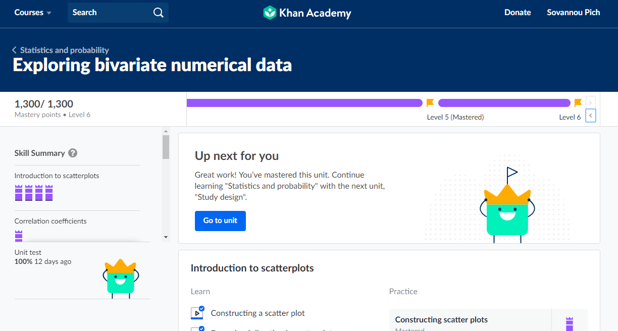
In the class, we used many resources including, Barron’s AP Statistics textbook, The practice of Statistics textbook and Khan Academy, our most used technology website resource for better maximize our learning and learning of each other.
At the beginning of the lesson we went over one chapter which was to learn how to read stem-plot. Do you know what is a stem-plot? Stem-plot is a type of data visualization that depict shapes, center and spread.
Shape, center and spread are the three types of distribution that given from stem-plot, dot plot and histogram or sometimes people may use box plot to represent as well.
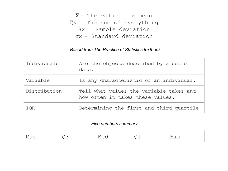
Based from what I learned, mean and median are the measure of center symmetric distribution: mean is an accurate measure of center.
Let me show you some of the symbols we used in analyzing the statistical data:
We then continue our lesson to learn about the density curve which it is a mathematical model that is always on or above horizontal axis and has an area exactly one underneath it. Through this lesson we went over Empirical rule which is the 68-95-99.7 rules to calculate z-score and how many deviation or data is away from the mean.
If you happen to use T-83 calculator you can generate probability or the raw data Or you can also generate a z-score from your calculator by typing:
normalcdf(lowerbound, upperbound, mean, deviation) --> Raw data
invNorm(area,mean, deviation) --> raw data
invNorm(%) --> z-score
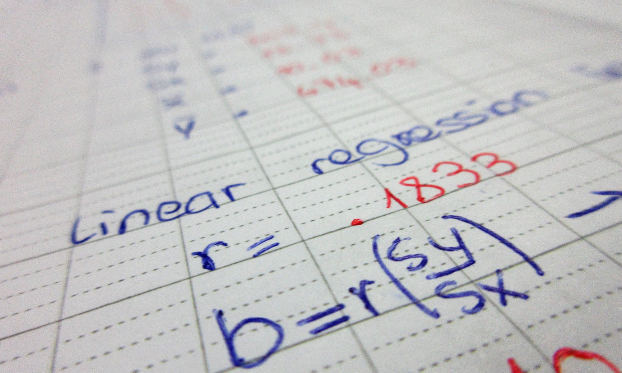
We then dive into correlation chapter. Correlation is what make scatter-plot to see the point correlate. In order to describe a scatter plot it requires form, direction and strength.
Form - linear or nonlinear
Direction - positive or negative
Strength - weak, moderate or strong
r = correlation coefficient intuition, it is the value that determine how correlated the data is together. -1 < = r <= 1
When there is a -r it is a negative association and when there is a +r it is a positive association.

What do you think the association of this scatter-plot?
Well the above scatter-plot show a positive association even the correlation isn’t close to each other. Remember that the mean of least square regression line is always zero.
Most of all, I am very enjoy learning statistics even though I’m not good at it. It teaches me to think and analyze better and harder than I ever did. These are just small things that combine to explain to all of you of what I learned in math class however we learn even more than that. I will try my best even though I have no plan to take the exam next year and will keep pushing myself to try harder and harder to maximize my learning.